Award-winning quilter Kate Sandford needed a brand identity that matched her bold, improvisational approach to quilting. Moving beyond traditional sewing clichés, I created a vibrant 80s-inspired identity that celebrates her colorful personality while maintaining the professionalism needed for client presentations and art exhibitions.
I arranged an initial meeting with the client, in which it became clear that she wanted a rebrand but was unsure of what deliverables to ask for. Together we ran through her business model, noting the platforms she primarily operated on and the ways in which she communicates with her customers. This offered insight into her business and allowed me to identify deliverables which would suit her specific business style. The main aim with this process is to ensure our deliverables help the client to achieve their goals.
Logo Development
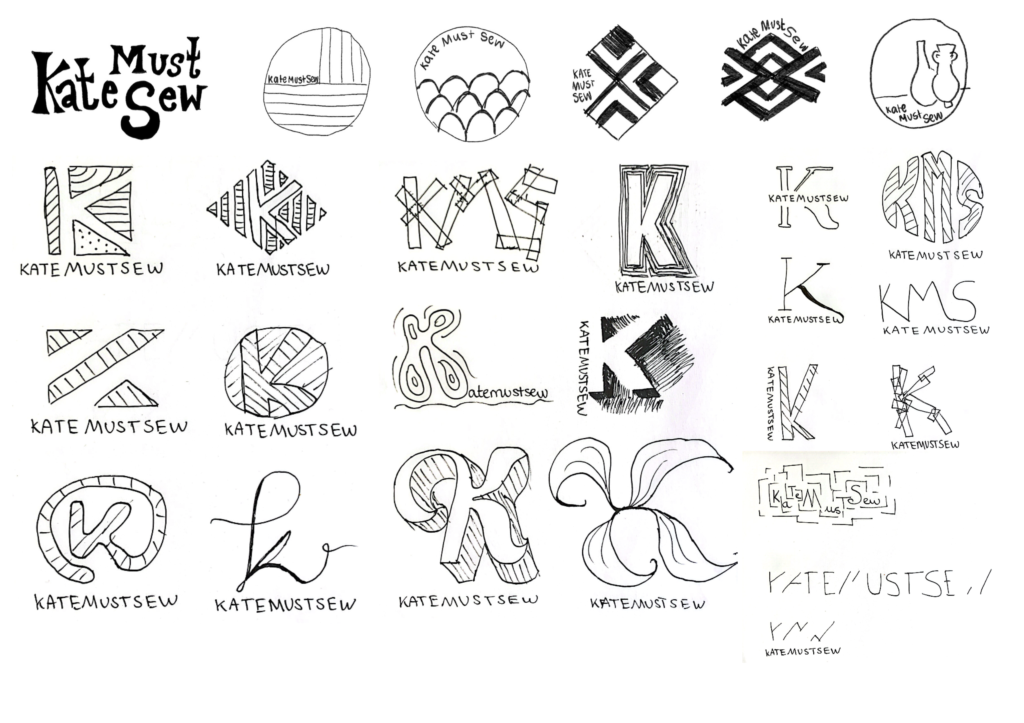
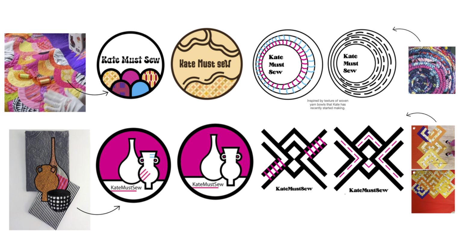
I explored a range of different approaches, with some typographic and others more shape and pattern focussed. The client's response made the next steps clear; she liked bright, bold colours with a playful edge—but not too much—as she wants her business to appear serious. She also emphasised that she dislikes the abbreviation 'KMS', cursive/ threadlike typefaces and cliché sewing iconography (such as thread spools). Furthermore, it felt important to capture the client's love for 70's typography and the colour hot pink in my future developments.
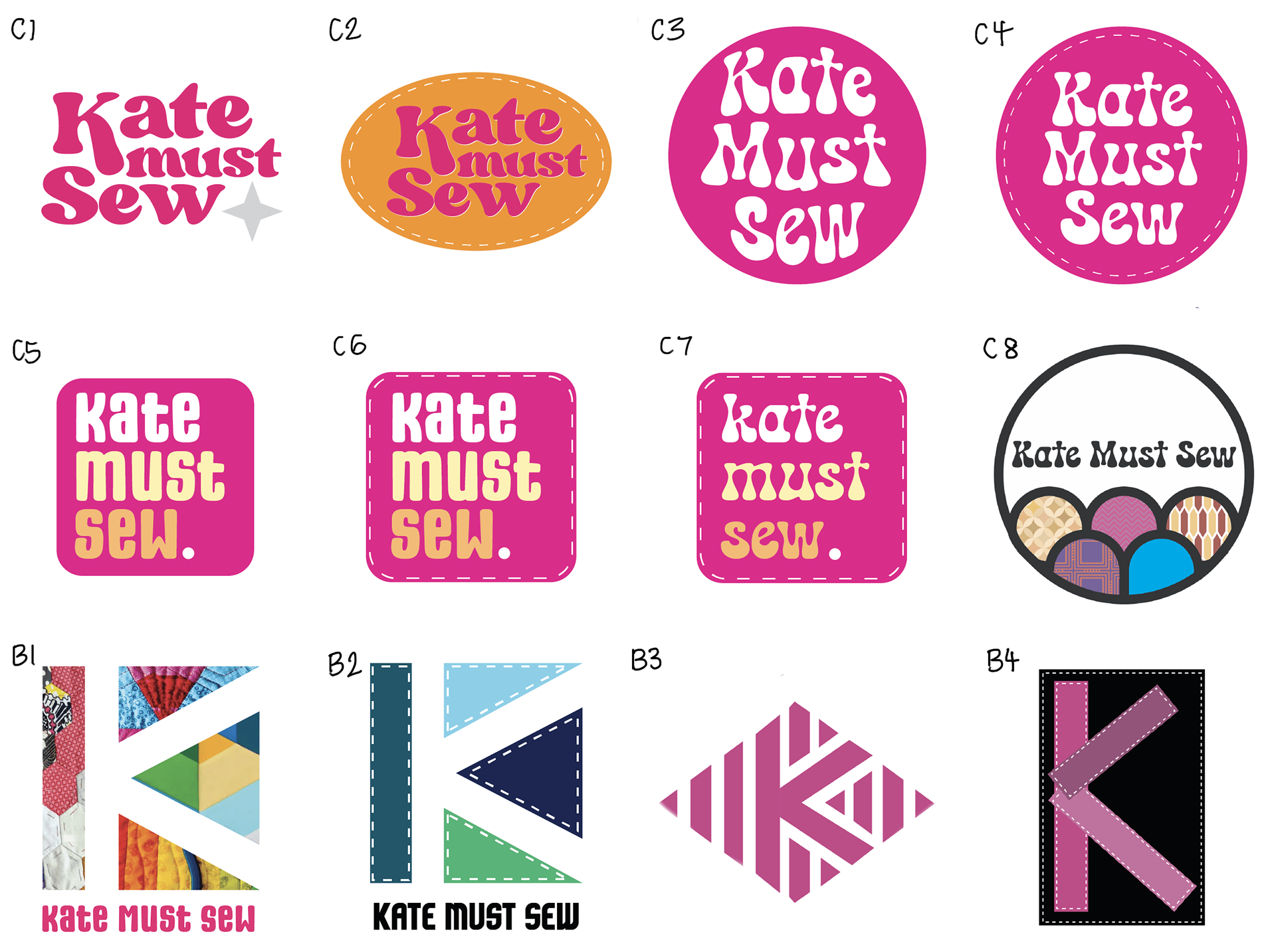
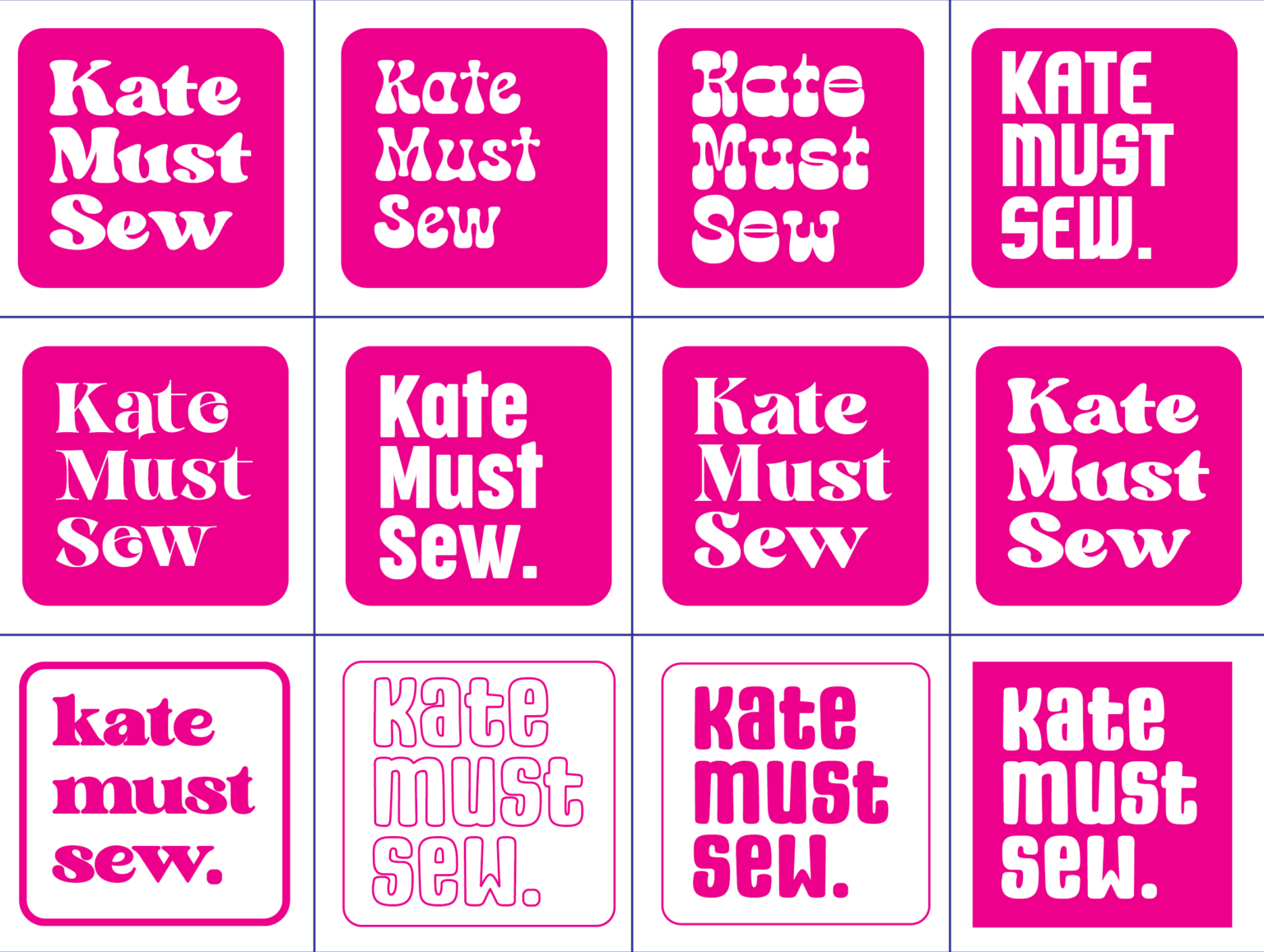
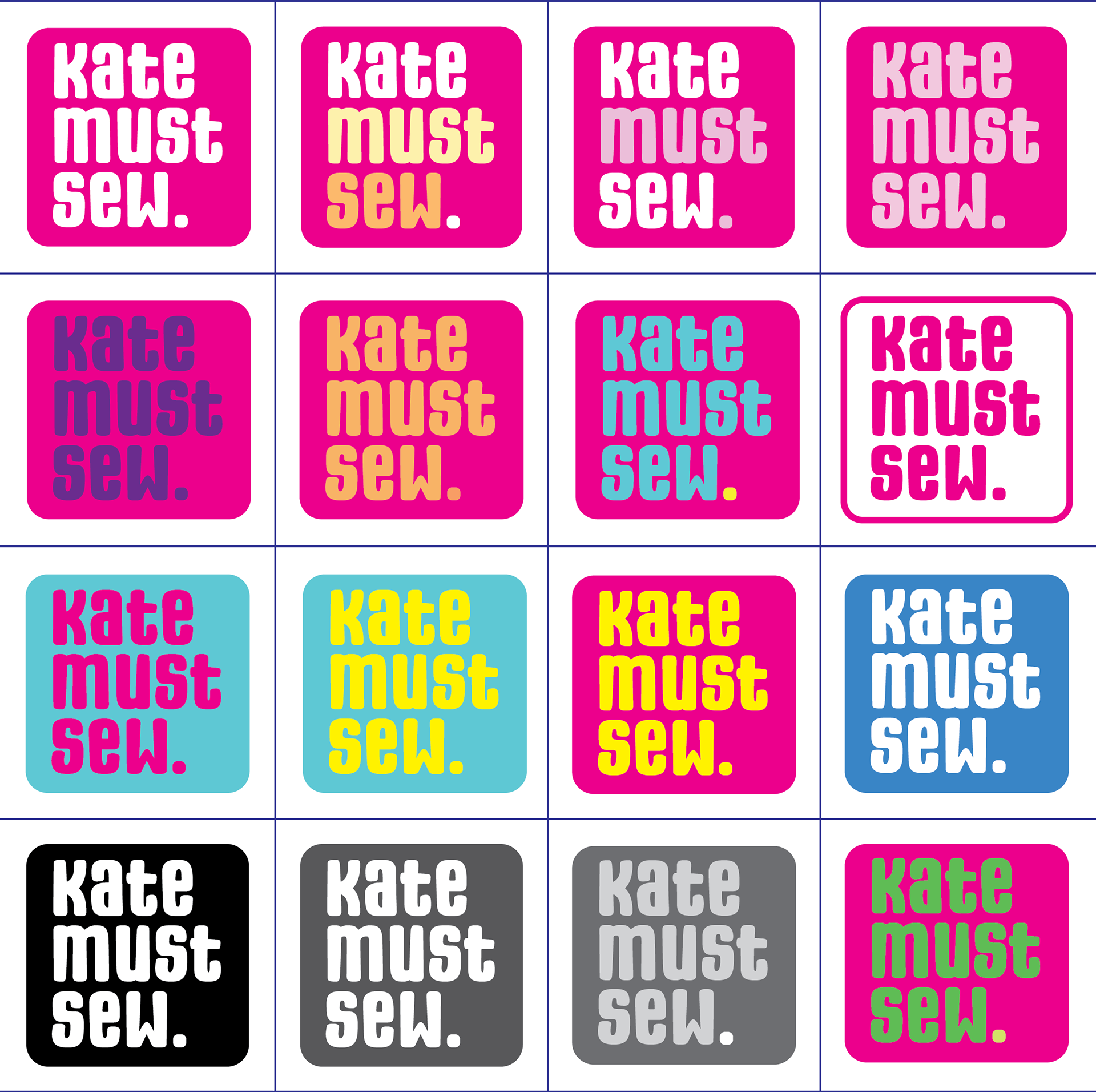
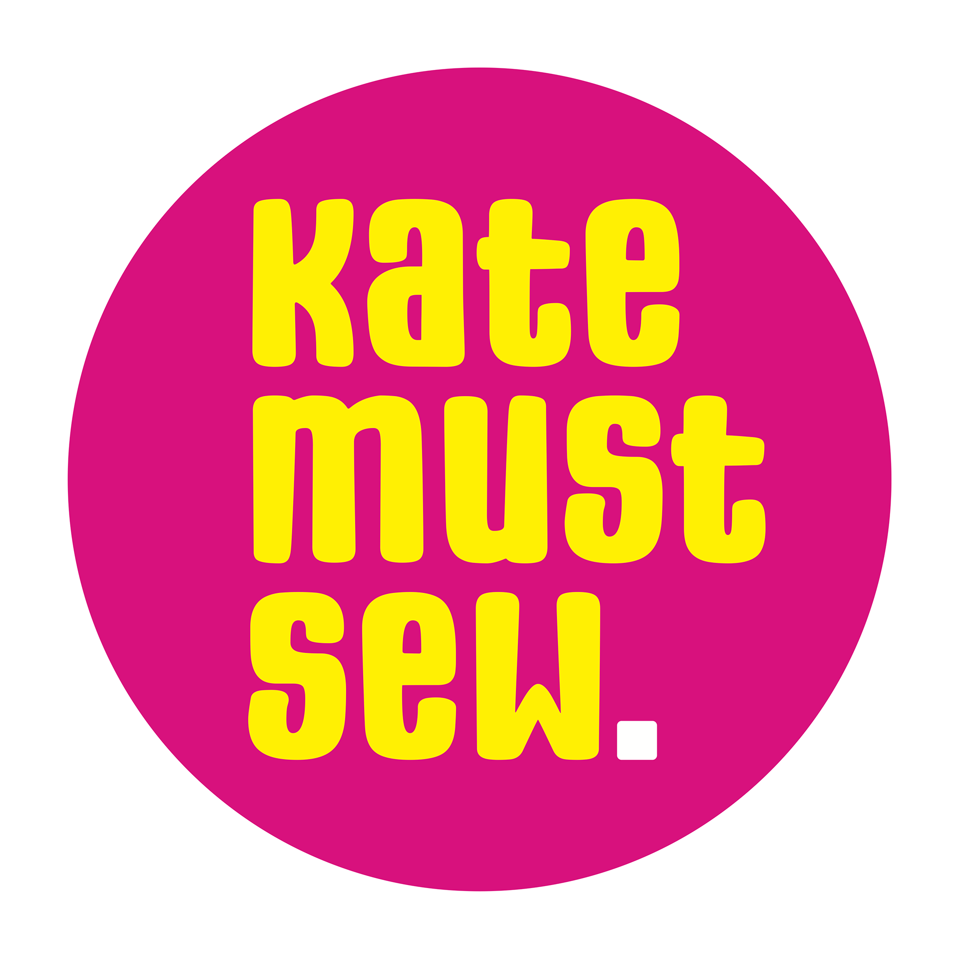
The final logo and wordmark designs successfully capture the quirky and handmade nature of the small business as well as the brightness and energy of Kate's quilts. The hot pink and bright yellow colour scheme informed the brand guidelines for this project and they have been continued across the business cards, website and video.
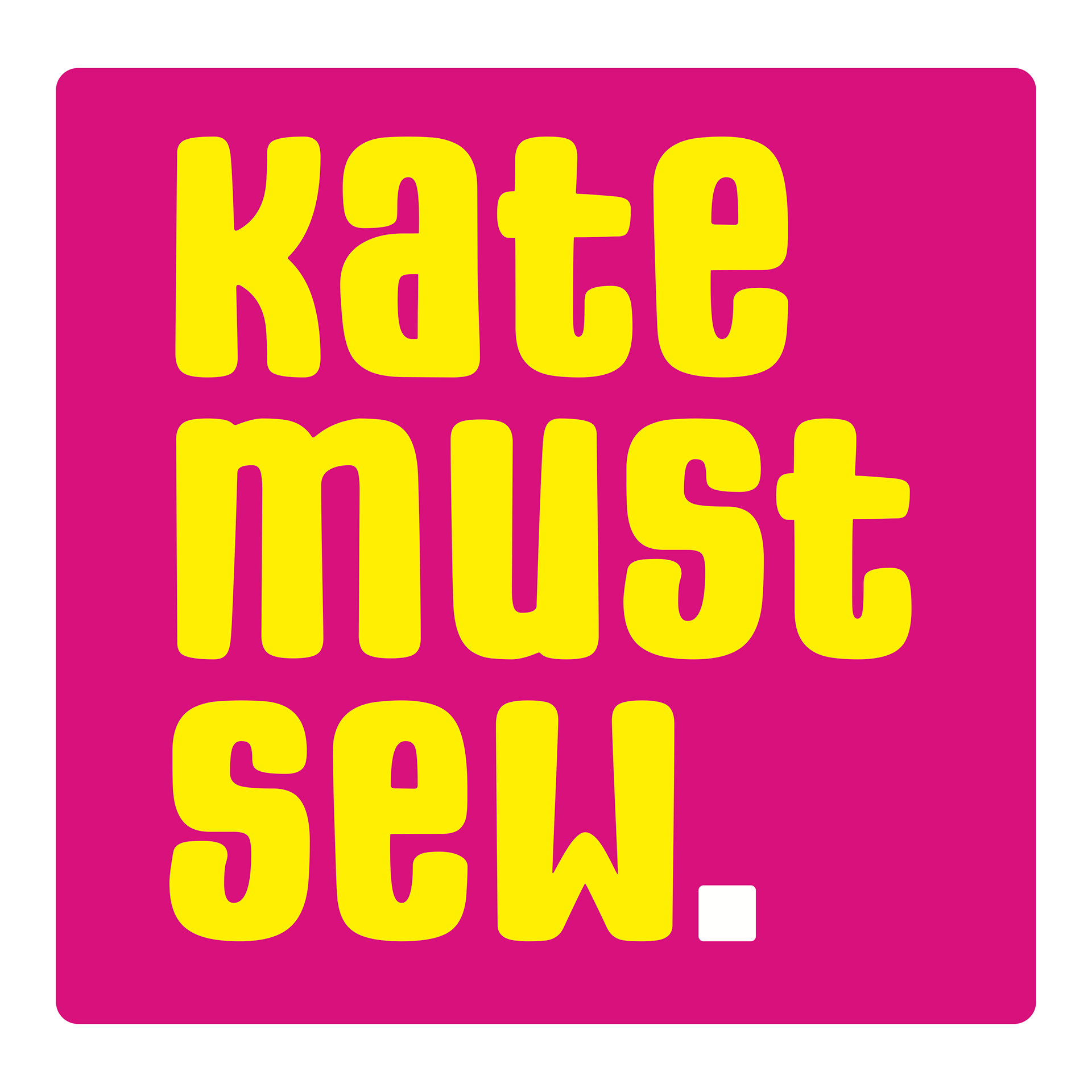
Primary Logo
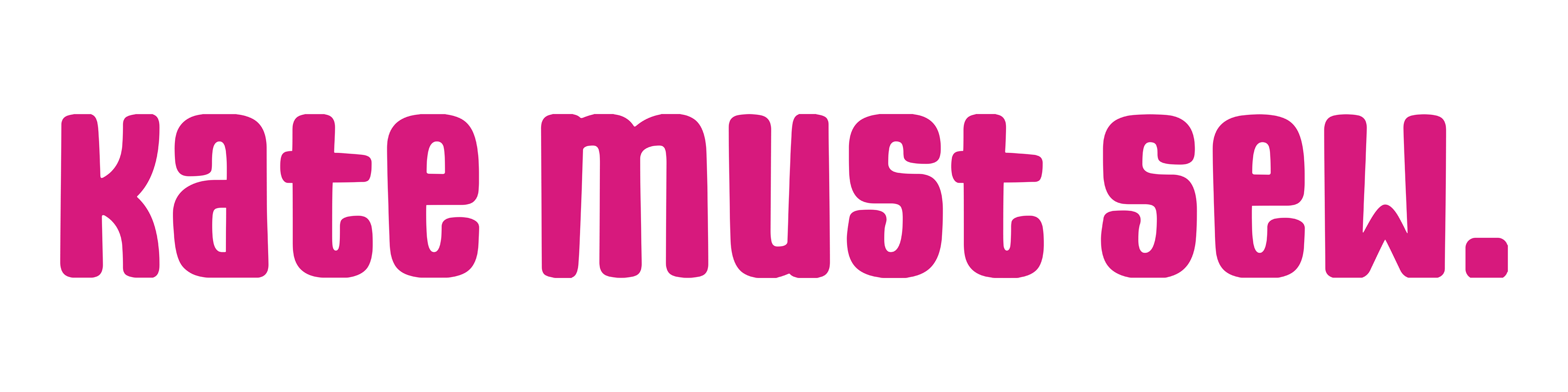
Alternative Landscape Wordmark
Secondary Logo
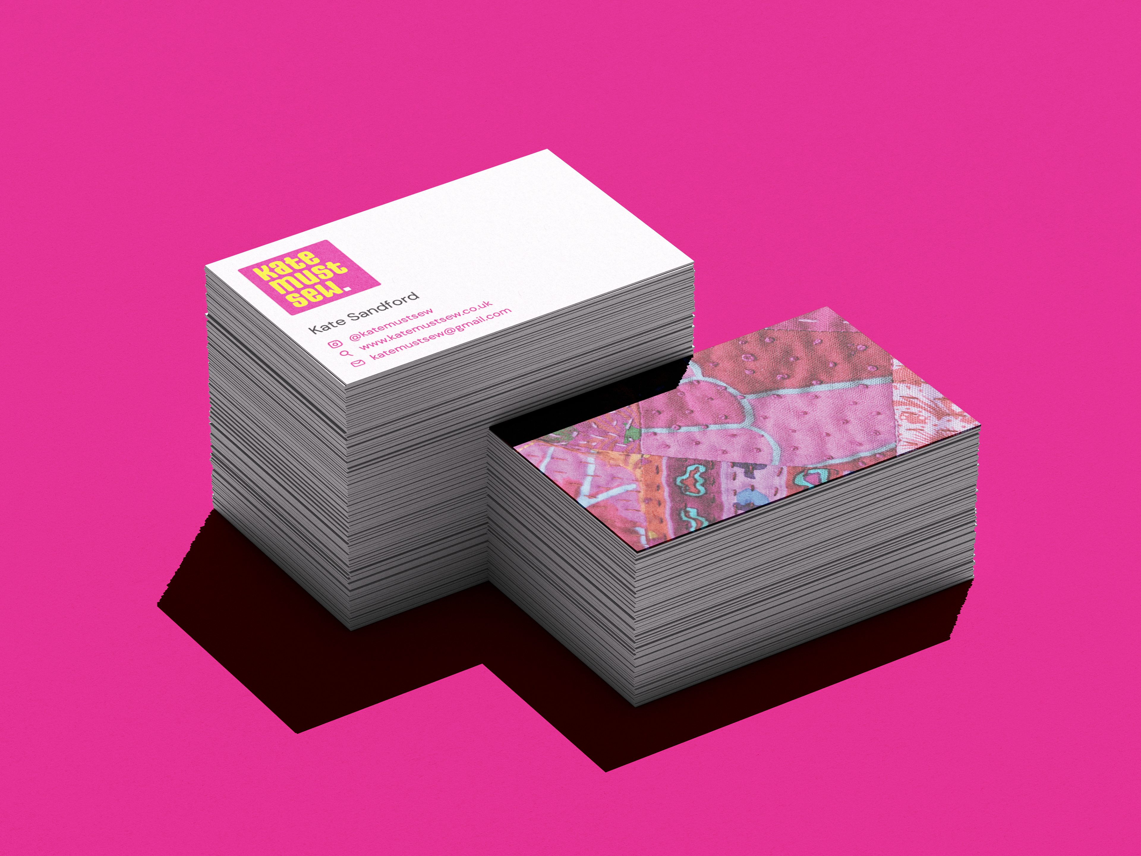
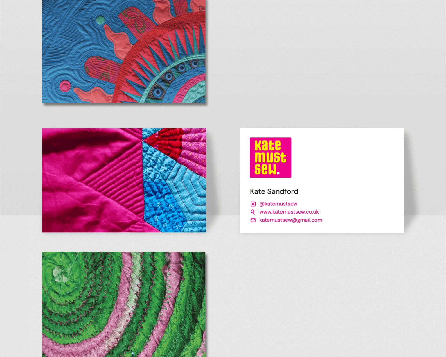
Business Cards
The business cards are designed to serve as miniature portfolios, with each card featuring a full-bleed image of Kate's quilting work on one side. This approach allows for multiple card designs showcasing different pieces, giving Kate variety when networking at exhibitions and events. The reverse side maintains the brand's professional aesthetic with clean typography and pictogram-based contact information, making it universally readable while avoiding clutter. The generous white space ensures the focus remains on Kate's craftsmanship while the subtle pink text reinforces brand recognition.
YouTube Intro (Animation)
The final animation satisfies the client's needs for it; it is suitable for a range of uses, straight to the point, punchy and quick. It is also visually coherent with the rest of Kate’s branding, meaning that when customers click on a video they will instantly recognise Kate’s brand and know they are in the right place.
Website
Since the client has never had her own website before, and operates her business primarily on Instagram and through an external website, she was initially unsure of what to ask us for. My research for the website process included re-visiting the websites I had identified as effective in the competitor analysis and reviewing user personas, noting down their different needs. As the website is hosted on Squarespace, I had to adapt to learn the software and create a website which Kate could continue to edit herself.
The rebrand successfully positions Kate as both an approachable teacher and serious quilting artist. The flexible identity system works across digital platforms and physical materials, helping her reach new audiences while confidently representing her work at exhibitions and client meetings.