Collaborating in a five-person team, we created a comprehensive brand identity for the University of Reading's Typography & Graphic Communication degree show. 'Punct' combines punctuation with punk aesthetics, celebrating the department's typographic expertise while reflecting the rebellious spirit of emerging designers ready to challenge industry conventions. As a visual brand we decided not to establish one particular logo, and instead we set out to create a highly impactful and recognisable visual style. This visual style combined scanned in punctation marks from letter pressed wood blocks (resulting in authentic texture) with impactful colours.
My role as Social Media lead placed me primarily in-charge of the event's social media channel (@punctdegreeshow) whilst I also worked with the team to create a vast range of digital and print assets, from physical invites to large scale wall panels.

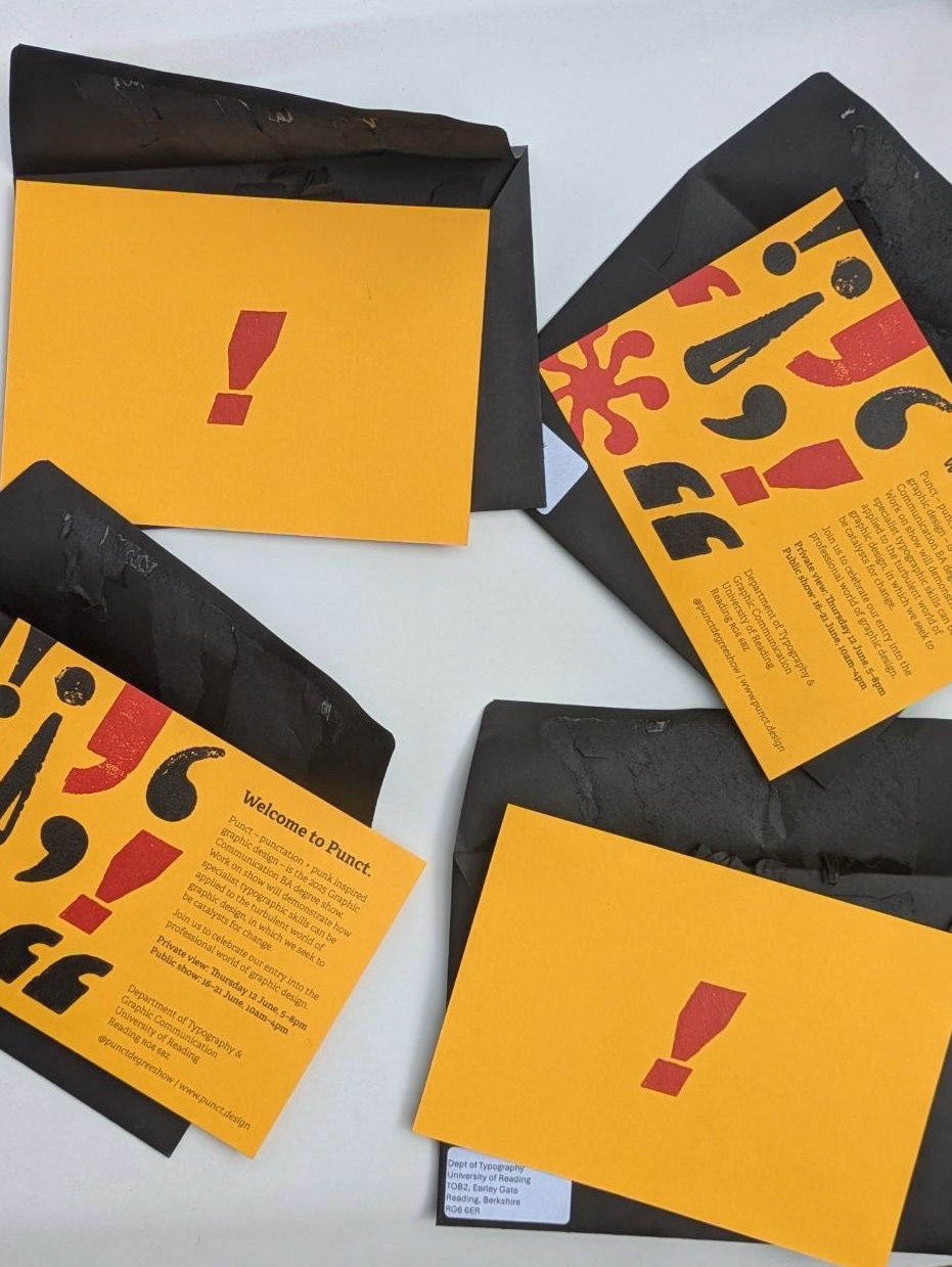
Physical Invites
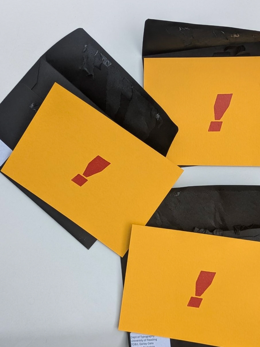
When designing the physical invites we focused on the user experience. We wanted there to be impact when opening the design, as this invite is one of the first branded elements that our invitees would see. We discussed stock options with the printers, choosing GF Smith Colourplan ‘Citrine’, on 350gsm, a heavy stock which colour matched our brand. We made the design A6, ensuring the physical invite was concise and, in combination with the heavy card stock, it had a solid feel. We ordered black envelopes, as this stood out as a more significant letter than that of regular white envelopes. This black also highly contrasted the Citrine stock, complementing our design.
On the opening side of the invite there is a single red exclamation point, which aimed to create intrigue and excitement when the user takes the invite out of the envelope. The back of the invite included a pattern design of punctuation marks and a short entry of text inviting the user. Designing the physical invite forced us to explore all aspects of the process, even ones we hadn’t considered before this project. For example, we chose to order peel and seal envelopes, hugely speeding up the packaging of envelopes so we the team could send them to our invitees by the deadline. These invites were mailed to over 1500 contacts of the department.
Social Media
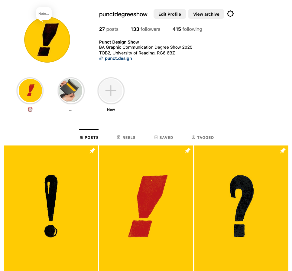
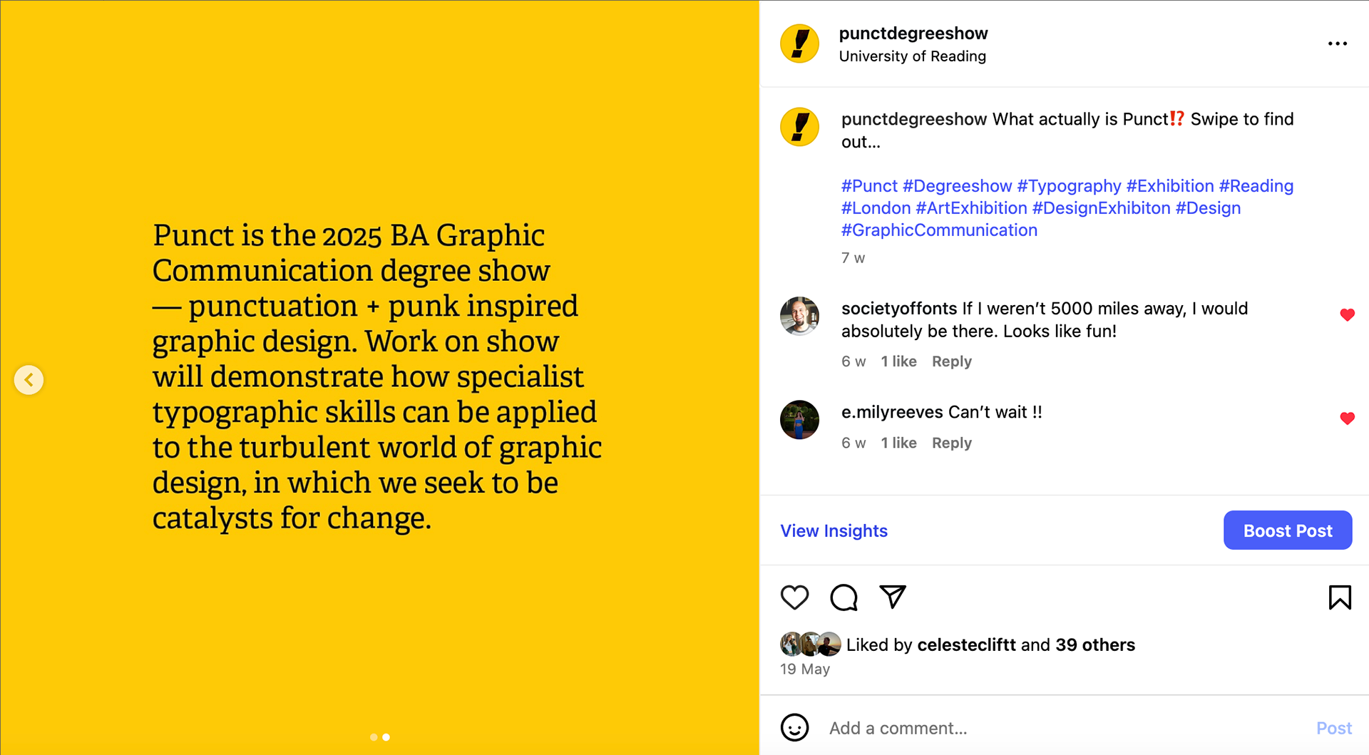
I ran a social media campaign throughout the whole build up process with the main aim of the Punct Instagram being to build excitement for the show, share key information and promote the student’s work.
I began by researching the main ‘rules’ of Instagram, as none of us had prior experience in running a professional account. This taught me the the importance of posting consistently, something I did throughout the project timeline with my posting schedule keeping me accountable to this. I also utilised Instagram tools such as countdowns, polls, collaborative posts and hashtags to increase engagement and help Instagram users who may be interested in our show find the account. These techniques proved effective, and our account had a high level of engagement which can be seen through the account insights.
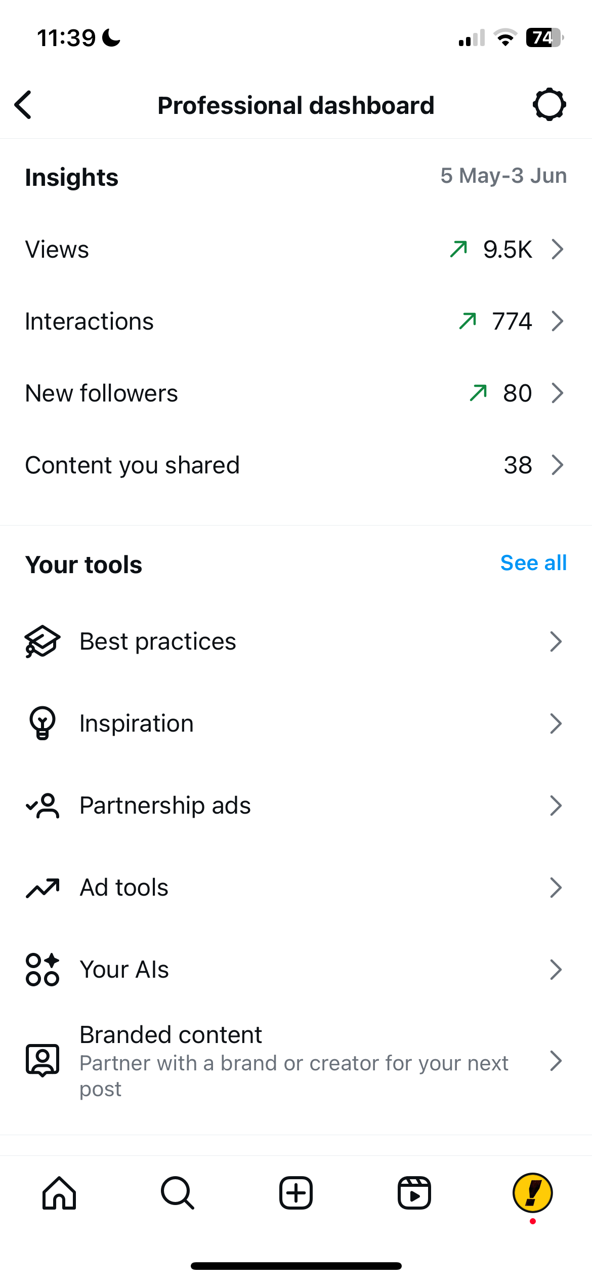
Account Insights
One of the challenges was balancing how much to share – we wanted to build excitement and show off the fun things we had planned, however we had to make sure we didn’t give too much away. To resolve this, we posted story posts of a sneak peak of the invites being sealed, but waited until all recipients would have received them to post a reel of the full invite design. Through these posts we built excitement for our show, but also promoted a link for users to receive a physical invite next year.
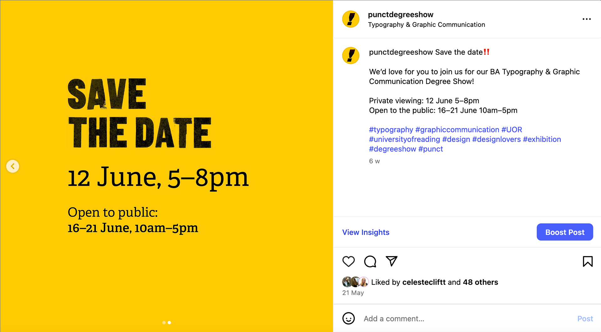
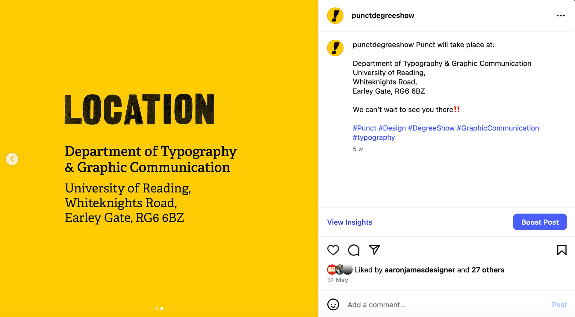
I also created and posted 3 main information posts, sharing the location, date and time details and explaining our theme. We pinned these to the top of the page, meaning they were easy to find and do not get lost amongst the student work.
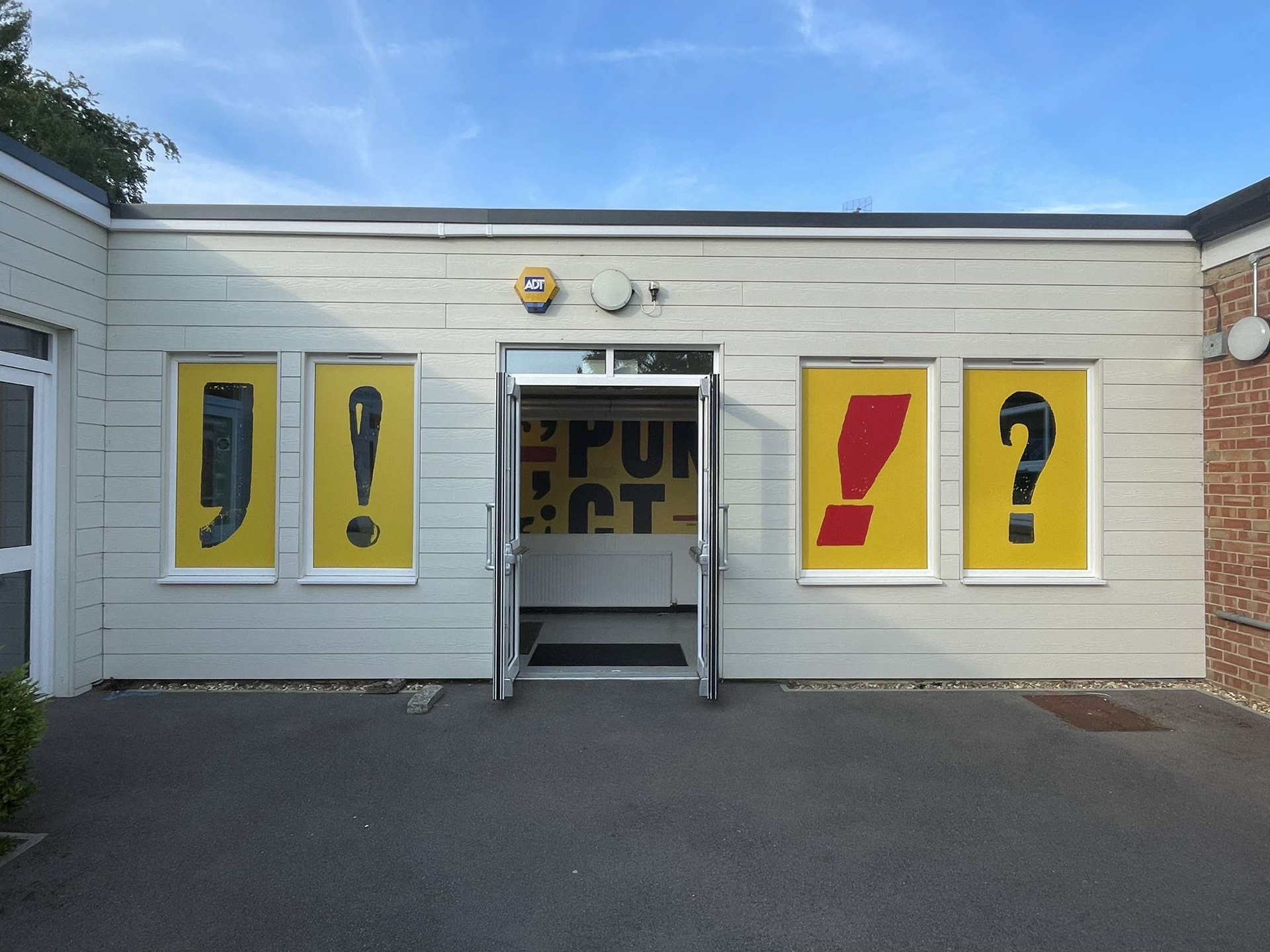
Large Scale Physical Elements
Window Decals & Table Banner:
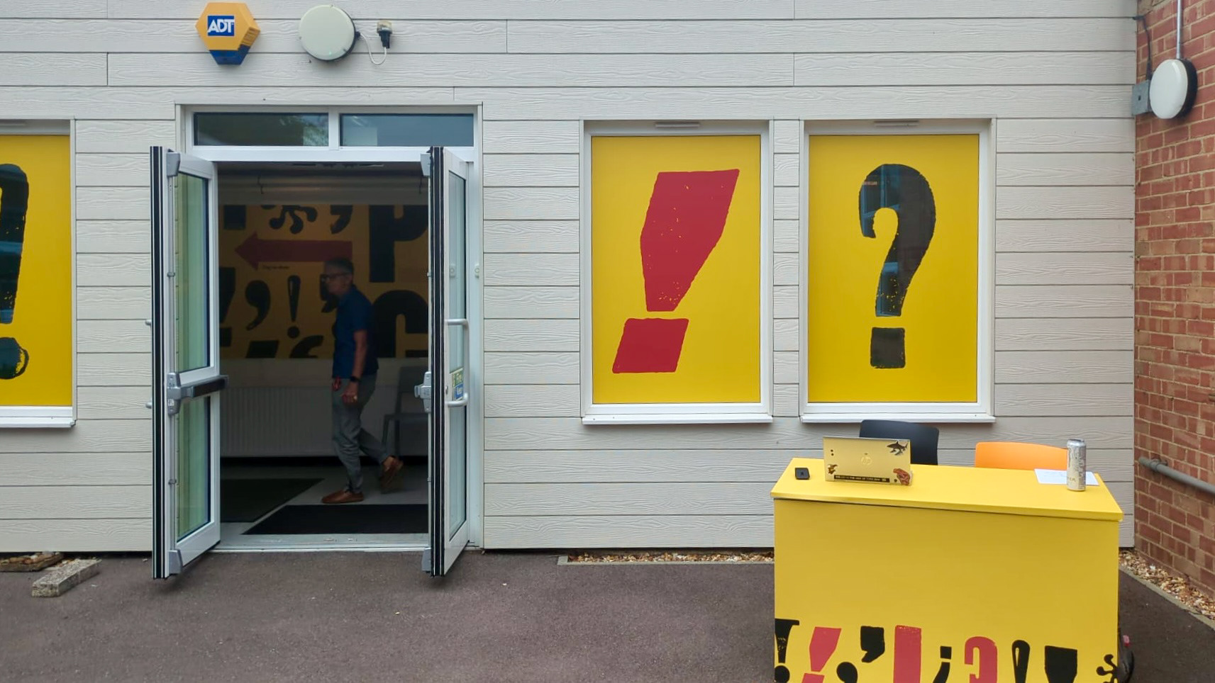
The window decals were highly visual assets marking the entrance to the show. The decals used scanned punctuation marks cut as a negative from a yellow block colour. We decided to make these punctation marks as cutouts as we wanted the light to shine through the yellow background and the cutout shape, which created interesting shadows in the main entrance hallway. We ensured these decals reflected our brand, but didn’t include any direct brand references like the name of the show, allowing these graphics to stay up after the show had finished, continuing to be complimentary elements to the department. The table marquees help to to create a continuous branded experience from the exterior of the building into the show, bringing branding to the outside welcome desk.

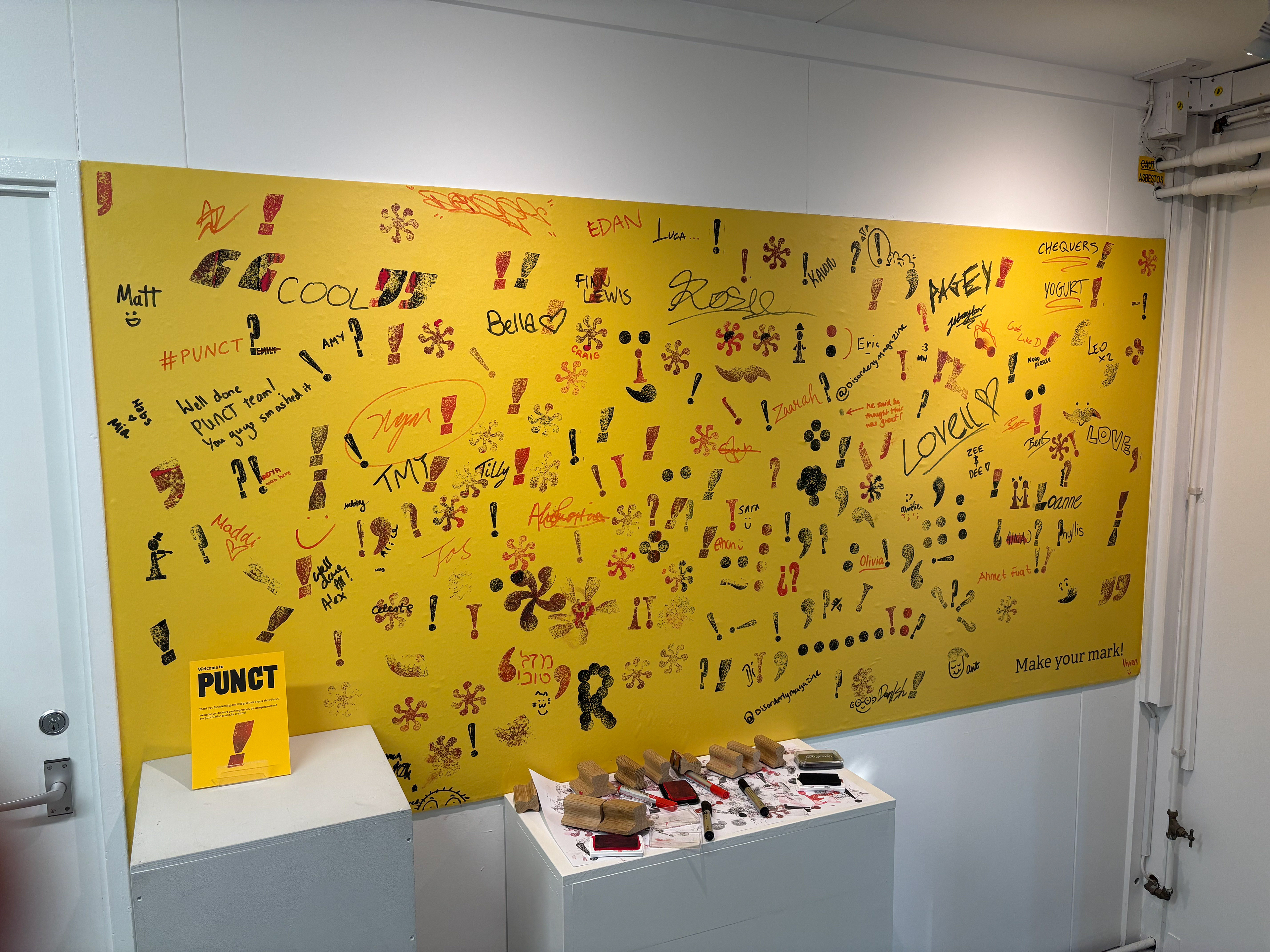
Interactive Stamp Panel:
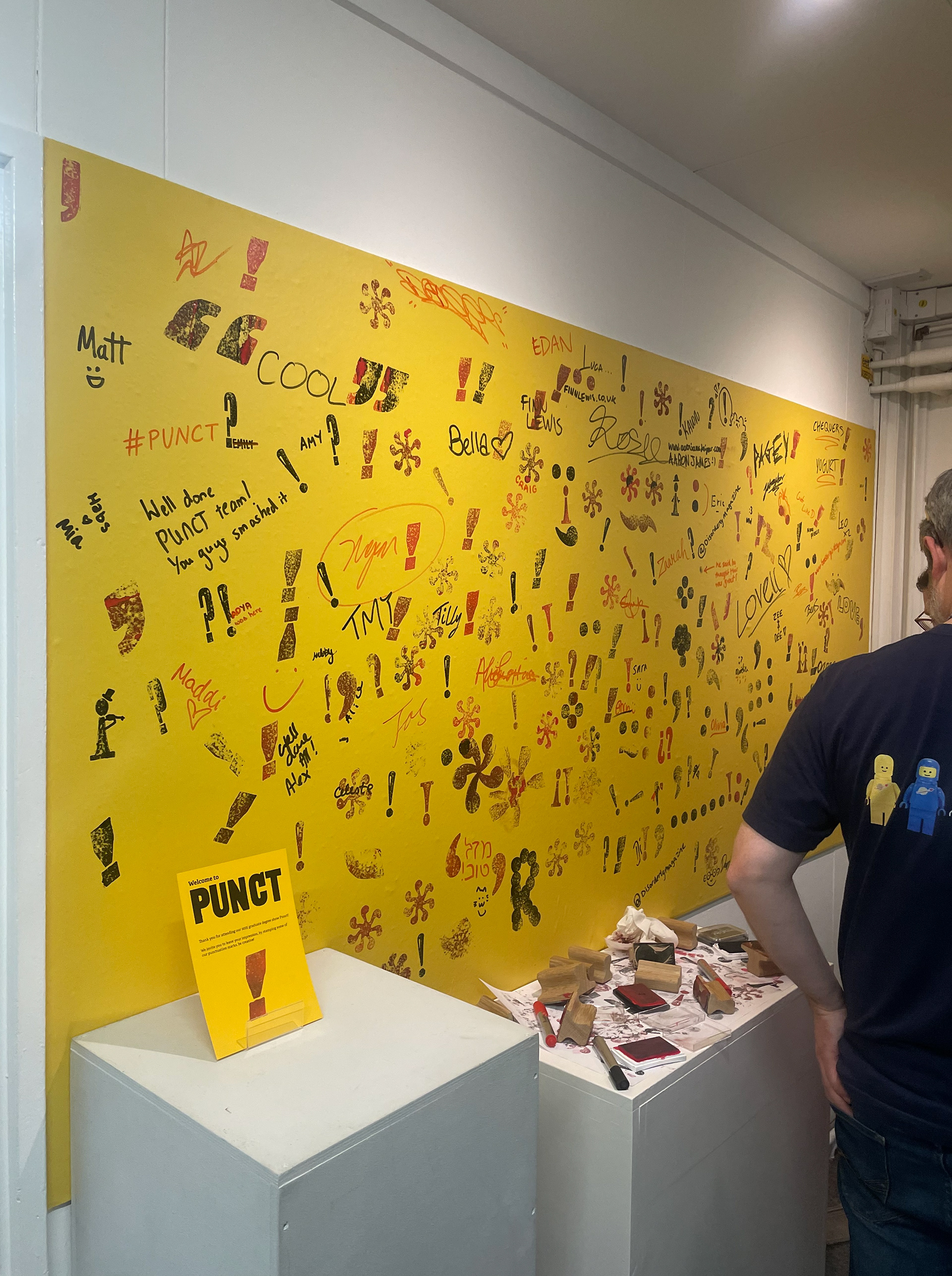
The ‘stamp’ panel introduced a more experimental concept. It allowed attendees to engage with the show by stamping a panel with a mark of our brand, as well as writing personal messages. This created an interactive element which engaged visitors and was very well recieved on the show day!
Website
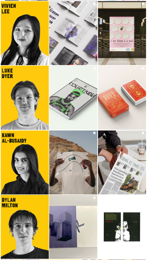
The website serves as a virtual exhibition space, intended for users that could not attend the show, or visitors of the show that want to look again at student work and find contact details. The main page of the site showcases a piece of work from each student, each of these works have been chosen by us, the team, to best represent our course. Across the selection of works we aim to showcase works from all projects as evenly as possible, with the inclusion of magazines, packaging, UX, editorial, word and image, and typeface design. Upon clicking these selected works the user is taken to page of the respective student.
The project was a success, with the Punct brand identity proving very popular amongst visitors. The show’s core branding elements reflects both the course and our graduating year, both as designers and in the skills we have learnt. The comprehensive system created a cohesive journey from initial invitation through to exhibition experience, with social media engagement exceeding previous years and positive feedback on the expanded use of space and interactive elements. Seeing the show in action was deeply rewarding, seeing all of our hard work on display and appreciated by the visitors.
This project has expanded my knowledge beyond regular submissions, as we found we had to consider many unknown aspects of designing for physical spaces and building up a brand whilst slowly revealing it, all whilst remaining fully engaged with the production process. My role as Social Media Lead has also strengthened my knowledge of content creation for a brand account and my time-managment skills through the importance of sticking to my posting schedule.
To see more, please view the Punct Instagram, and the Punct website.
Team project led by Jony Hodgson, with Celeste Clift, Finn Lewis, Aaron James, and Ben Sturgis